
Harley-Davidson Skin Care
MISSION: To create skin care packaging and display design that expands the Harley-Davidson brand image to a new market. The target audience is focused on young-spirited, upwardly mobile audience of professional men and women (22-50 years old) that have taken to the new line of Harley-Davidson motorcycles for weekend joy-riding to quell their inner rebel spirit. They like their business, bikes, and appearance to be sharp.
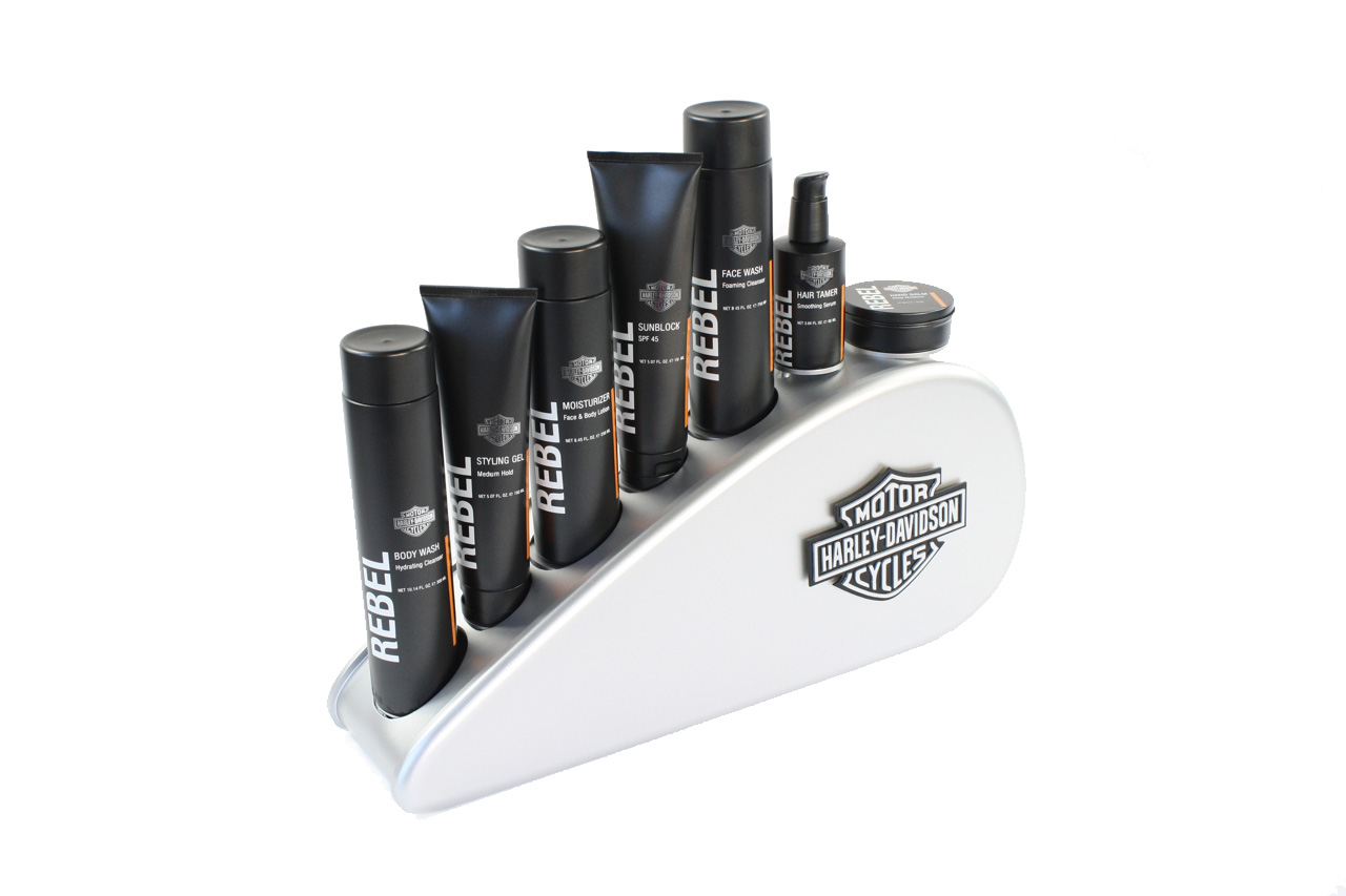
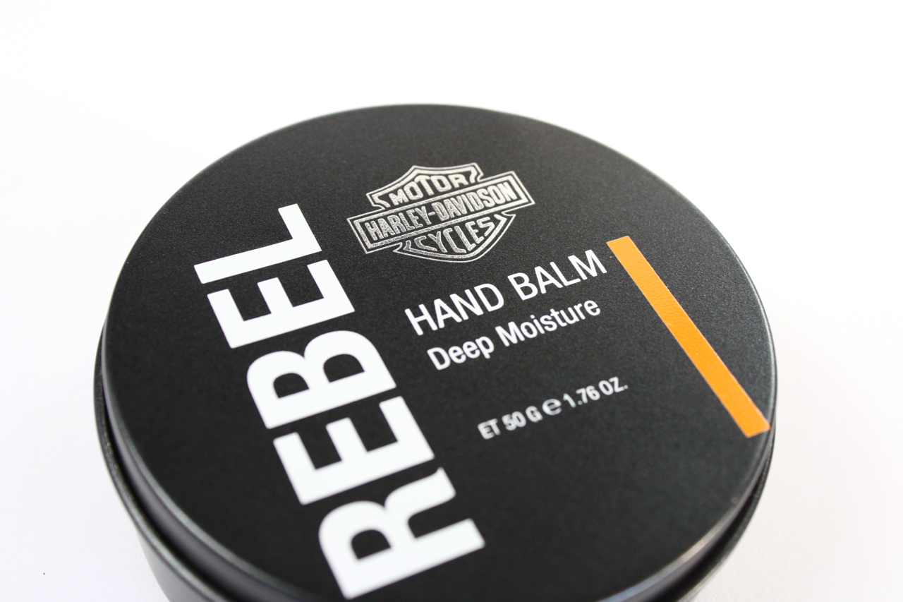
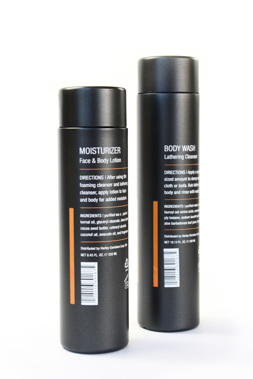
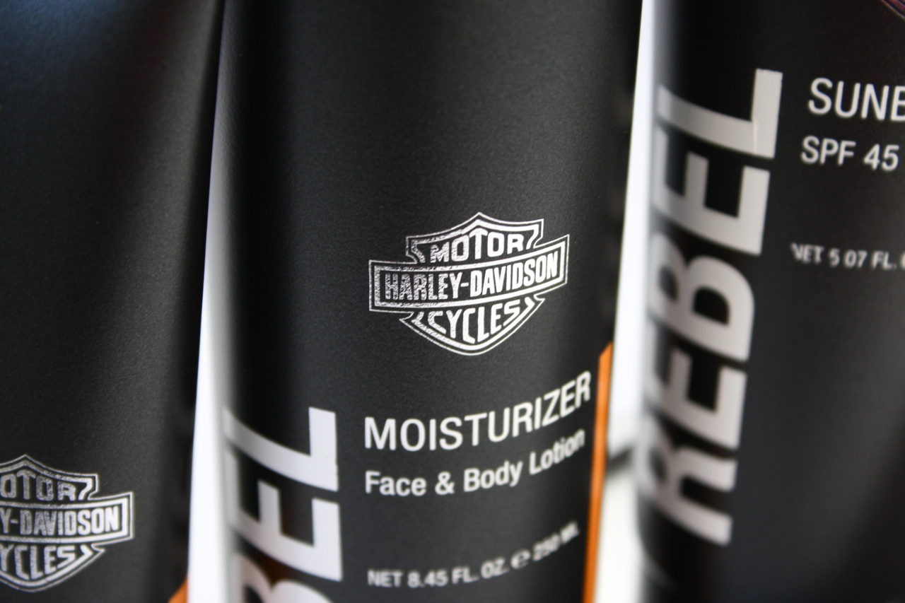
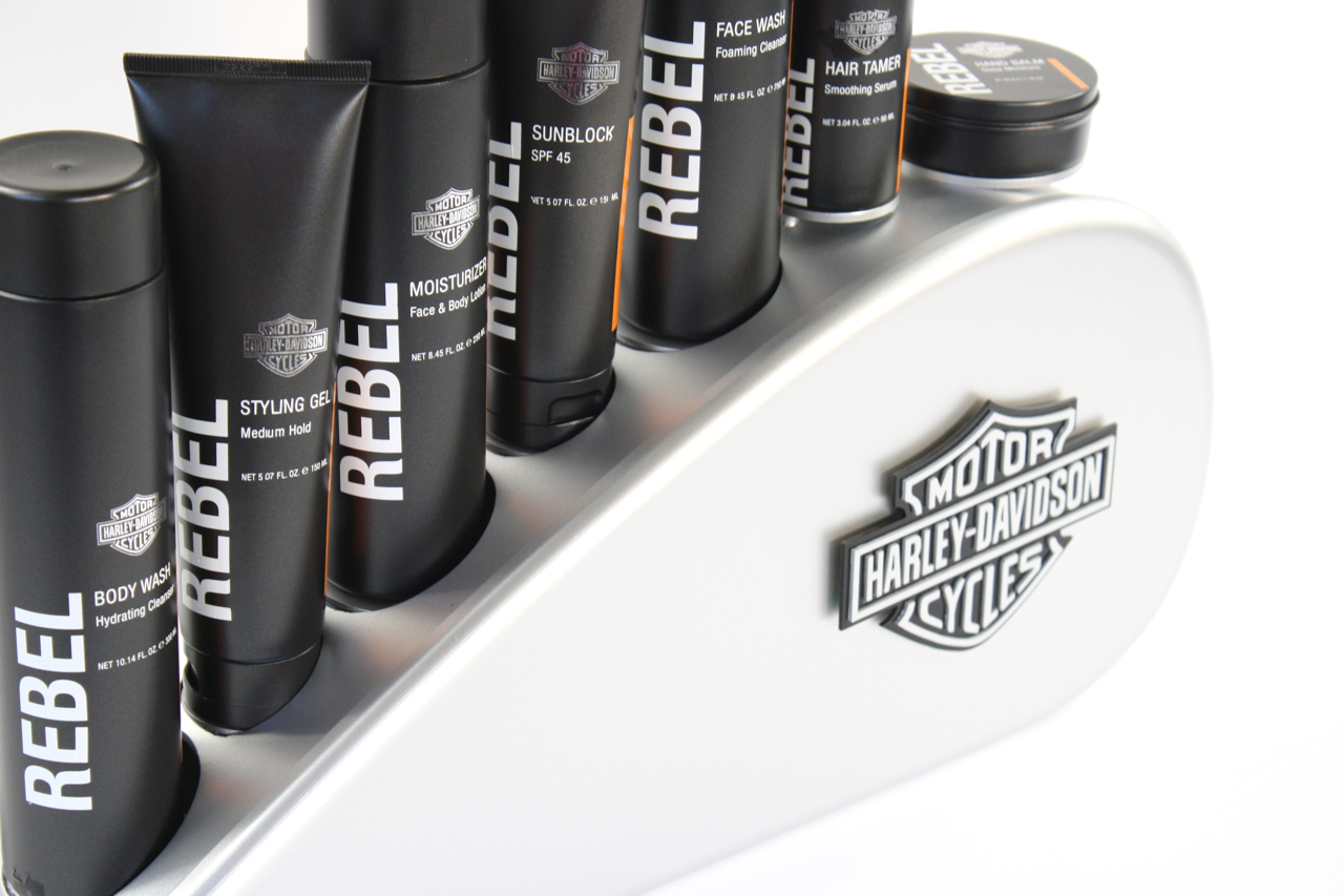
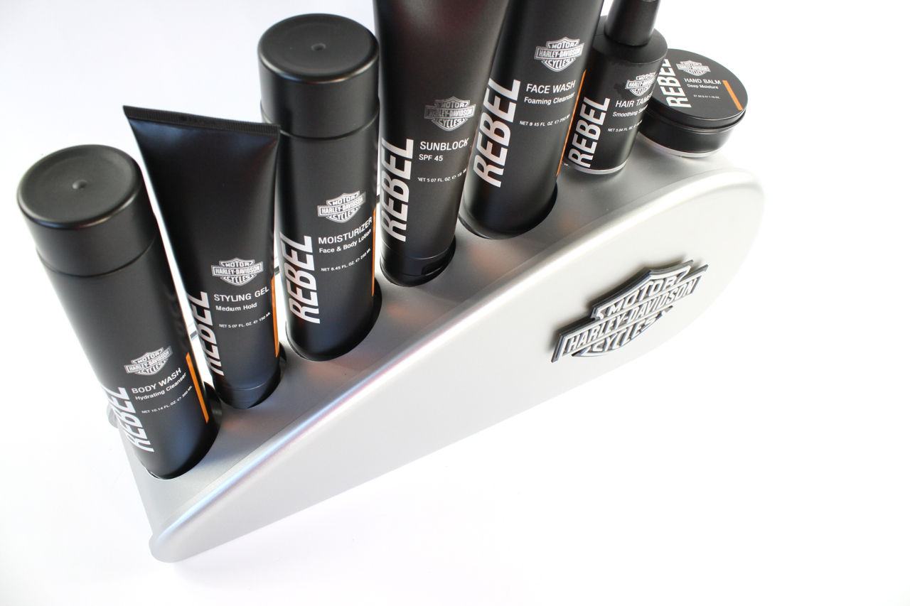
TACTICS: Through ample company and audience research and numerous rounds of sketching, , creating mood boards, audience profiles, and design briefs, I developed the concept for a line of skin care and hair products for the contemporary Harley-Davidson "Rebel." Less grungy more sharp, this line of products would lend itself more to Harley-Davidson's new line of motorcycle designs which emphasize sleeker styling, predominately in black and silver finishes. I designed 6 bottle and 1 tub design for a line of unified products in black and chrome with the Trademark Harley-Davidson orange accent lines.
INSIGHTS: The heart of the Harley-Davidson brand is loyalty, and a shared spirit of independ-
ence and love for freedom. The purpose of the brand extension was to capitalize on this desire for freedom in all kinds of people and reach out to a new market who have the potential to become Harley customers. As much as Harley's image is tough, rugged, and fiercely independ-
ent, its also sleek, stylish, and alternative. Through market research, it became clear that these traits would be attractive to a contemporary professional who works hard but also likes to relax and have a bit of edge. Sleek, independent, and smart became design essential keywords.
ASSUMED PERSONAS: Every stage of the design process for this project required that I took on the role that was needed. I became a researcher, interviewer, rendering artist, prototyper, product designer, packaging designer, project manager, creative director, craftsman, and more. It was a great experience to go through the process of developing a 3-D product, package, and display design, and to carry through the production to professional level.